Drew An-Pham
Collection of my GIScience Work
RP- Spatial Accessibility of COVID-19 Healthcare Resources in Illinois
Reproduction of: Rapidly measuring spatial accessibility of COVID-19 healthcare resources: a case study of Illinois, USA
Original study by Kang, J. Y., A. Michels, F. Lyu, Shaohua Wang, N. Agbodo, V. L. Freeman, and Shaowen Wang. 2020. Rapidly measuring spatial accessibility of COVID-19 healthcare resources: a case study of Illinois, USA. International Journal of Health Geographics 19 (1):1–17. DOI:10.1186/s12942-020-00229-x.
Reproduction Author: Drew An-Pham
Reproduction Materials Available at: RP-Kang Repository
Created: 19 May 2021
Revised: 26 May 2021
Introduction
The original study by Kang et al. (2020) aimed to rapidly measure the spatial accessibility of COVID‐19 healthcare resources (ICU beds & ventilators) in Illinois for both vulnerable populations—defined as people over 50-years old—and actual COVID-19 patients. To execute their analysis, an enhanced two-step floating catchment area (E2SFCA) method outlined by Luo and Qi (2009) was used; this looked at the outcome of interactions between demands (i.e. # of potential patients) and supply (i.e. # of beds of physicians). Their findings revealed an uneven distribution of healthcare resources across Illinois, with central and northern Chicago having greater access to these resources than southern Chicago.
In creating a methodology that was computationally efficient, geospatially scalable, and open source, their procedures were documented via a CyberGIS Jupyter Notebook, enabling anyone with access to reproduce their study. As well, Kang et al (2020) have also maintained an open platform called WhereCOVID-19 to provide up-to-date information on healthcare availability.
Reproducing Kang et al’s (2020) work is critical for verifying the results of their analyses, alongside giving students and other academics a stronger eye for critically investigating research papers’ methodologies. Additionally, by running and making comments/modifications to the original code, suggestions can be made to improve the original methods used. Together, both of these motives can help further the trustability and merit of Kang et al’s (2020) paper in informing policymakers and public health practitioners about the allocation of healthcare resources or the distribution of healthcare infrastructure.
Materials and Methods
The Python script (with inline comments & improvements) used for this reproduction can be found here
The data sources used for this reproduction matched those of Kang et al (2020):
- Road network data was obtained from OpenStreetMap and accessed in the code via a Python Library called OSMNX
- Population data (census tracts) came from the American Service Community
- Hospital data was collected from the US Homeland Infrastructure Foundation Level Data (HIFLD)
Briefly outlining the methods used in the original study’s Jupyter Notebook (learn more about this open source initiative here) as modified by Joseph Holler, libraries and input files were first loaded, then road networks were processed to remove isolated nodes—self contained parts of the road network or dead ends. After, hospitals were snapped on to the nearest network nodes for the network analysis later. The code then created population centroids, derived catchment areas around hospitals, and calculated the influence of each hospital on their respective catchment area(s). Accessibility for each hospital was then measured and weighted by distance, proceeded by an overlap function that took sum of accessibility for each hexagon of the grid in the given grid shape file. The results (given as Geodataframes) were then normalized and visualized, producing a map of hospital accessibility across Chicago.
Deviations from & Improvements to the Original Code
The largest problem identified in the original code was that the road network used was restricted to the bounds of Chicago. Therefore, regardless of their distance from Chicago, the hospitals outside the city were not captured/accounted for in the road network. As a result, since the HIFLD hospital points included hospitals outside city limits, these points were still snapped to their nearest nodes in the road network, creating a boundary effect inaccurately portraying accessibility along Chicago’s periphery (i.e. northwest Chicago has a false area of low accessibility). To fix this, a 15-mile buffer (~24 km) was applied to create a larger more inclusive road network, properly accounting for hospital points in the latter analysis.
# Load and Plot Street Network
G = ox.graph_from_place('Chicago', network_type='drive', buffer_dist = 24140.2)
Once the buffer was added, errors in the OSM data syntax made it impossible to run the original code. For example, one-way streets with speed limits “25, east” could not be read by the code, which expected entries like “25 mph.” To resolve this, try except code blocks were used to assign these hardcoded data errors Kang et al’s (2020) default speed of 35 mph. Special thanks to Maja Cannavo for troubleshooting and resolving this problem.
# network_setting function
if (speed_type==str):
# add in try/except blocks to catch maxspeed formats that don't fit Kang et al's cases
  try:
    if len(data['maxspeed'].split(','))==2: # removes comma separation, turns into #s
      data['maxspeed']=float(data['maxspeed'].split(',')[0])
    elif data['maxspeed']=='signals':
      data['maxspeed']=35.0 # drive speed setting as 35 miles
    else:
      data['maxspeed']=float(data['maxspeed'].split()[0])
  except:
      data['maxspeed']= 35.0 # if error caught, code will go to this block and fill 35
else:
  try:
    data['maxspeed']=float(data['maxspeed'][0].split()[0])
  except:
    data['maxspeed']=35.0
Three other revisions made to the code to improve it’s functionality were…
- adding time benchmarks to key sections of the code; These processing time outputs serves as a great metric for the quantifying the efficiency of Kang et al’s (2020) code, connecting back to their intent of attaining rapid measurements spatial accessibility to COVID-19 healthcare resources.
%%time ''' Example time output after function runs: CPU times: user 1min 29s, sys: 2.03 s, total: 1min 31s Wall time: 1min 31s ''' - altering the color palette of final map; In cartography, the use of a red color scheme or red symbology often denotes exclusion or danger in a geopolitical context (van Houtum & Lacy, 2020). Since our final deliverable is looking at hospital accessibility, changing the color palette to a Purple, Blue, Green gradient strays away from this misinterpretation and adds aesthetic value.
# out_put map function ax=output_grid.plot(column=resource, cmap='PuBuGn',figsize=(18,12), legend=True, zorder=1) - changing the original distance weights utilized; Kang et al (2020) applied a set of weights (1.00, 0.68, & 0.22) to respective travel time zones (0-10, 10-20, & 20-30 min) to account for distance decay in their analysis. These weights were derived from Luo & Qi’s (2009) paper, which used the same E2SFCA method to assess spatial accessibility to primary care physicians in northern Illinois. In their results, Luo & Qi (2009) referenced a second weight set that represented a shaper distance decay: 1.00, 0.42, & 0.09. I applied these weights to further investigate the impact of distance weights on healthcare accessibility outcomes.
# Run the Model Section
weights=[1.0, 0.42, 0.09] # weights where weights[0] is applied to distances[0]
Results & Discussion
The final repository used for this reproduction can be found here
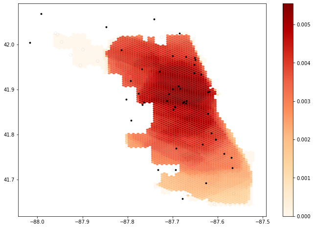 figure 1. Output map from original unedited code provided.
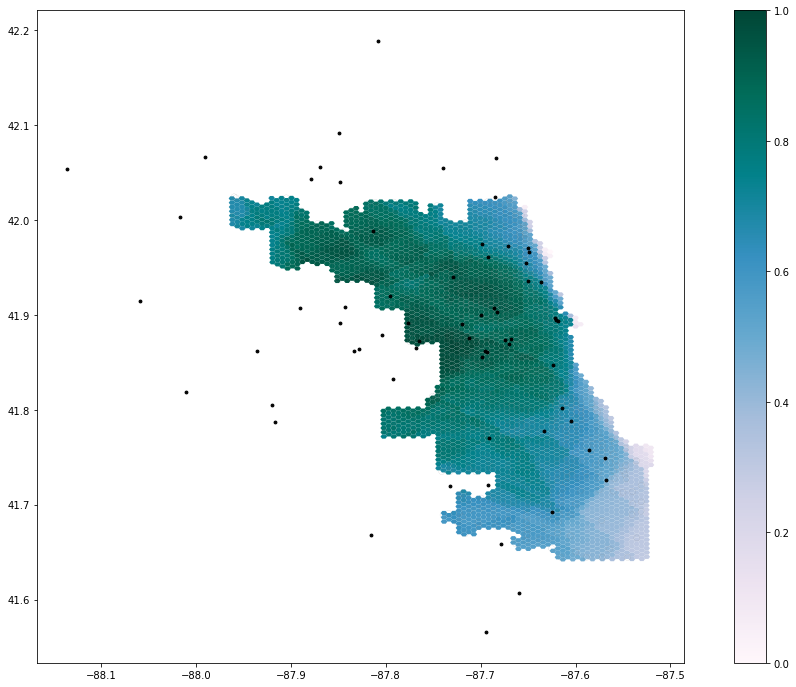 figure 2. Output map using the expanded road network (15-mile buffer) and changing the color palette; the original weights from Kang et al (2020) were still used—1.00 at 10 minutes, 0.68 at 20 minutes, and 0.22 at 30 minutes.
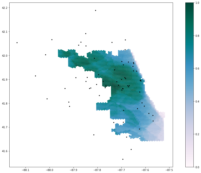 figure 3. Output map using the expanded road network (15-mile buffer), an alternate color palette from fig. 1, and a different weight set from Luo & Qi (2009)—1.00 at 10 minutes, 0.42 at 20 minutes, and 0.09 at 30 minutes.
Comparing the results of figures 1 & 2, expanding the road network with the 15-mile buffer increased hospital accessibility in northwest Chicago, highlighting how this area was actually well-serviced by hospitals outside of Chicago’s boundaries. Thus, the inclusion of a larger road network appears to have improved the contextual accuracy of the original study’s map. The different set of distance weights used in figures 2 & 3 both indicate that central Chicago has the greatest accessibility to COVID-19 healthcare resources—hospitals with good ICUs and ventilator capacity. As well, this figure pair shows the consistently low healthcare access in southeast Chicago. However, deviations in these visualizations spotlight the degree of impact weighting can have on these results. By emphasizing sharper distance decay, figure 3 upholds a high accessibility value in central Chicago, but is surrounded by a ring of decreasing accessibility—indicative of more distant hospitals becoming less impacting. Figure 2 emphasizes a slower distance decay, where accessibility appears to be more evenly spread across the city. Thus, this contrast in weighting schemes between output maps has significant implications on how policymakers and public health practitioners allocate and distribute healthcare resources across the city during the COVID-19 pandemic; a more even spread of accessibility may undermine the supply an under-resourced hospital needs, while a more polarized spread may inaccurately portray the demand of a well-resourced hospital.
After reading through the original study and executing this reproduction, an uncertainty I had about the code that wasn’t explained in the paper was the justification behind using “over 50”—a category from the census data—as the metric for defining at risk populations. While there is a common association of increased health problems with age, I question if this “over 50” cateogory is truly inclusive of at risk populations in Chicago, especially given the dynamic socio-economic and demographic patterns (factors that should also be considered) across the city. As well, the overlap_calc function in the Jupyter Notebook included a series of intersects, some of which I wouldn’t have been able to connect back to original study without the help of in-class discussion, presenting the benefits of the collaborative investigation of research & sharing inline comments.
Conclusion
Kang et al’s (2020) study is a great example of work contributing to the field of open source research. By providing us the code and data via a Jupyter Notebook alongside their paper, Kang et al (2020) enabled us to successfully carry out a reproduction of their original study. Through this process, my confidence in the validity of their original study increased. However, a critical part of this reproduction as well came from the adding inline comments to clarify the code and/or link it back to the original report with fellow classmates, showcasing the benefits of open source code as means for collaborative learning and valuable teaching. Finally, for future research in this domain, prioritizing the investigation of different weights and improving the road network’s inclusivity of hospitals would help further improve Kang et al’s (2020) model of spatial accessibility to healthcare resources.
Acknowledgments
Once again, special thanks to Maja Cannavo for troubleshooting and writing the code that fixed the road network processing function, as a result of OSM data syntax faults. Also, thanks to all the GEOG 0323 students for their collaborative efforts during lab and crowdsourcing ideas for code modifications, to Professor Holler for helping us set up the reproduction repository for this analysis, and to Kang et al (2020) for making their Python code available to us/the general public.
References
Kang, J. Y., A. Michels, F. Lyu, Shaohua Wang, N. Agbodo, V. L. Freeman, and Shaowen Wang. 2020. Rapidly measuring spatial accessibility of COVID-19 healthcare resources: a case study of Illinois, USA. International Journal of Health Geographics 19 (1):1–17. DOI:10.1186/s12942-020-00229-x.
Luo, W., & Qi, Y. (2009). An enhanced two-step floating catchment area (E2SFCA) method for measuring spatial accessibility to primary care physicians. Health & place, 15(4), 1100-1107.
Van Houtum, H., & Lacy, R. (2020) The migration map trap. On the invasion arrows in the cartography of migration, Mobilities, 15:2, 196-219, DOI: 10.1080/17450101.2019.1676031